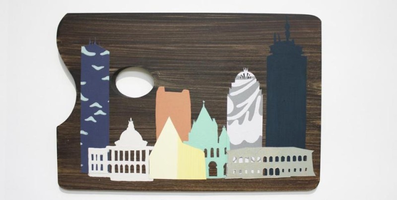
Can you make home look more like your favorite Boston landmark? Tastefully?
Interior designer Erin Gates took on the challenge in a newly curated palette for Farrow & Ball. The “Boston City Palette” of paints and wallpapers features a yellow stripe wall covering representing the Boston Marathon finish line. A deep slate blue does justice to the Charles River.
“It’s my favorite navy,” said Gates, author of the “Elements of Style” blog and recent book of the same name. “I’ve used it many, many times. It’s such a preppy staple New England color.”
The UK-based Farrow & Ball, which has a showroom in Boston, began collaborating with tastemakers across the country last summer. In the fall, Texan Bailey McCarthy, the blogger behind Peppermint Bliss, highlighted a bold yellow (inspired by the James Turrell Skyspace in Houston) in the Lone Star state’s collection.
But Gates’s palette is a bit more understated.
“It was a fun, creative exercise,” she said. “When you’re in design, you don’t actually get to be creative 100 percent of the time.”
She chose an elegant silver wallpaper to represent the magic of her favorite haunt, the Isabella Stewart Gardner Museum. And her Fenway paint is a soft, rich shade that Gates imagines seeing at a sunny summer game at the park.
“Even though it’s not a team color, it is in a way. It was the exact right color,” she said.
Jill Radsken can be reached at jill.radsken@gmail.com.
